Blog Post 0
The goal of this blog post is to create a tutorial on generating a visualization for the penguins dataset
Reading the Dataset
First let’s read in our dataset and take a look at the first 5 rows to get a better sense of what it looks like
import pandas as pd
url = "https://raw.githubusercontent.com/PhilChodrow/PIC16B/master/datasets/palmer_penguins.csv"
penguins = pd.read_csv(url)
penguins.head()
| studyName | Sample Number | Species | Region | Island | Stage | Individual ID | Clutch Completion | Date Egg | Culmen Length (mm) | Culmen Depth (mm) | Flipper Length (mm) | Body Mass (g) | Sex | Delta 15 N (o/oo) | Delta 13 C (o/oo) | Comments | |
|---|---|---|---|---|---|---|---|---|---|---|---|---|---|---|---|---|---|
| 0 | PAL0708 | 1 | Adelie Penguin (Pygoscelis adeliae) | Anvers | Torgersen | Adult, 1 Egg Stage | N1A1 | Yes | 11/11/07 | 39.1 | 18.7 | 181.0 | 3750.0 | MALE | NaN | NaN | Not enough blood for isotopes. |
| 1 | PAL0708 | 2 | Adelie Penguin (Pygoscelis adeliae) | Anvers | Torgersen | Adult, 1 Egg Stage | N1A2 | Yes | 11/11/07 | 39.5 | 17.4 | 186.0 | 3800.0 | FEMALE | 8.94956 | -24.69454 | NaN |
| 2 | PAL0708 | 3 | Adelie Penguin (Pygoscelis adeliae) | Anvers | Torgersen | Adult, 1 Egg Stage | N2A1 | Yes | 11/16/07 | 40.3 | 18.0 | 195.0 | 3250.0 | FEMALE | 8.36821 | -25.33302 | NaN |
| 3 | PAL0708 | 4 | Adelie Penguin (Pygoscelis adeliae) | Anvers | Torgersen | Adult, 1 Egg Stage | N2A2 | Yes | 11/16/07 | NaN | NaN | NaN | NaN | NaN | NaN | NaN | Adult not sampled. |
| 4 | PAL0708 | 5 | Adelie Penguin (Pygoscelis adeliae) | Anvers | Torgersen | Adult, 1 Egg Stage | N3A1 | Yes | 11/16/07 | 36.7 | 19.3 | 193.0 | 3450.0 | FEMALE | 8.76651 | -25.32426 | NaN |
Generating the Visualization
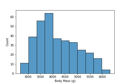
It seems like we have some descriptive data for our penguins (Culmen Lenghth, Culmen Depth …). Something interesting we can visualize is the distribution of weights for our penguins. We can visualize this with a histogram of our Body Mass (g) variable. To create this we will use seaborn’s histplot function.
import seaborn as sns
sns.histplot(data = penguins,
             x = 'Body Mass (g)')

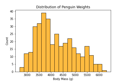
This is a great plot of getting a quick introduction to the distribution of weights for our penguins. We can change some parameters to adjust the bin size, title and color of our plot.
new_hist = sns.histplot(data = penguins,
             x = 'Body Mass (g)',
             color = 'orange',
             bins = 20)
new_hist.set(title = 'Distribution of Penguin Weights')
new_hist.get_figure().savefig('new_hist.png')

In this new plot, we have a different shade, smaller bin sizes (more total bins) to show a more refined distribution of our data and a title that describes the overall goal of our plot. This completes our short tutorial on creating a visualization in python on the penguins dataset and uploading it to a blog post on Github through Jekyll.